Common Web Design Mistakes You Need to Avoid
Your website is often the first impression your business makes so it needs to get it right. Discover the most common web design mistakes and how to avoid them to create a site that looks great and performs even better.
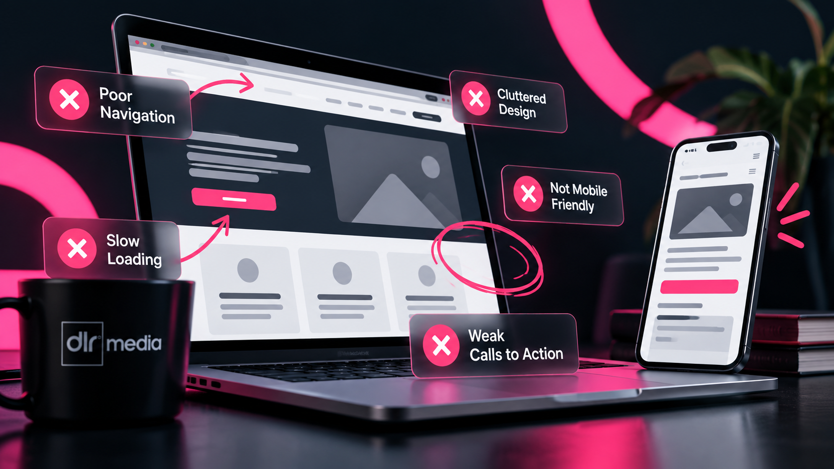
Your website is often the first interaction a potential customer has with your business—so it needs to make the right impression, instantly.
But here’s the thing: even well-designed websites can fall short if a few key fundamentals are overlooked.
The good news? These mistakes are easy to fix once you know what to look for.
1. Using Too Many Fonts
It might seem like a small detail, but typography can make or break your website’s look and feel.
Using too many fonts creates visual clutter and makes your site feel inconsistent and unprofessional.
What to do instead:
Stick to 2–3 fonts maximum
Use one for headings, one for body text, and optionally one for CTAs
Keep font sizes consistent and purposeful
Clean, consistent typography builds trust—and makes your content easier to read.
2. Not Using Enough White Space
White space (or negative space) isn’t “empty”—it’s a powerful design tool.
Without it, your website feels cramped, overwhelming, and difficult to navigate.
What to do instead:
Give elements room to breathe
Space out sections, text, and images
Use layout to guide attention
A well-spaced design helps users focus on what actually matters.
3. Poor Navigation Structure
If users can’t find what they’re looking for quickly, they won’t stick around.
Confusing menus and cluttered navigation are one of the fastest ways to lose potential customers.
What to do instead:
Keep menus simple and intuitive
Aim for users to find key information in 3 clicks or less
Use clear, descriptive page labels
Good navigation isn’t noticed—it just works.
4. Overusing Colours
Colour is a powerful branding tool—but too much of it creates chaos.
A busy colour palette can distract users and dilute your message.
What to do instead:
Stick to a core palette of 2–3 colours
Use one primary, one secondary, and one accent colour
Keep consistency across all pages
A focused colour scheme strengthens your brand and improves usability.
5. Forgetting Your Target Audience
This is where everything comes together.
Your website shouldn’t be designed for you—it should be designed for your ideal customer.
What to do instead:
Consider who you’re speaking to at every stage
Align design, tone, and content with their expectations
Make it easy for them to take action
When your website speaks directly to your audience, conversions follow.
Final Thoughts
Avoiding these common web design mistakes can be the difference between a website that looks good—and one that actually drives results.
A great website isn’t just about design. It’s about clarity, usability, and creating a seamless experience that turns visitors into customers.